
Outdoor furniture colour trend 2027 is all about creating spaces that feel intentional, calming, and visually connected to nature. If you’re planning to refresh your patio, balcony, or garden, colour is no longer just a finishing touch—it’s the foundation of the entire outdoor experience.
This guide breaks down the most important colour trends for 2027, explains why they matter, and shows you how to use them in real life. You’ll discover what colours are rising, which ones are fading, and how to choose combinations that actually work in your space—no guesswork, no overwhelm.
In This Article
Why Outdoor Furniture Colour Trends Matter More in 2027
Outdoor spaces are no longer secondary. They’ve evolved into functional extensions of indoor living, used for relaxing, entertaining, and even working.
Colour plays a bigger role than ever because it directly affects how your space feels.
The Emotional Power of Outdoor Colours
The right palette can completely shift the mood of your outdoor area:
- Soft neutrals create calm, spa-like environments
- Greens connect the space to nature and reduce visual stress
- Warm tones add energy and coziness
- Cool blues bring a sense of openness and freshness
A well-chosen colour scheme doesn’t just look good—it feels right.
Outdoor Living Is Now Design-Driven
Homeowners are treating patios and gardens like curated interiors. That means:
- Coordinated colour palettes
- Thoughtful layering of tones and textures
- A focus on harmony between furniture, flooring, and surroundings
Random colour choices are being replaced by intentional styling decisions.
Sustainability Is Influencing Colour Choices
Environmental awareness is shaping trends in subtle ways. Many 2027 colour directions reflect:
- Natural landscapes (earth, plants, sky)
- Long-lasting tones that won’t go out of style quickly
- Materials and finishes that age gracefully
Choosing the right colour is no longer just about aesthetics—it’s about longevity and impact.
Outdoor Furniture Colour Trend 2027: The Big Picture
The outdoor furniture colour trend 2027 isn’t about one dominant shade. It’s about a balanced mix of grounding neutrals, nature-inspired hues, and strategic accents.
What’s Driving 2027 Colour Trends?
Several lifestyle shifts are shaping these palettes:
- A desire for calm, retreat-like outdoor spaces
- Increased time spent at home
- Blending indoor and outdoor design styles
- A move toward less clutter, more intention
Key Colour Directions at a Glance
| Colour Direction | Mood & Effect | Best For |
| Earthy Neutrals | Calm, timeless | Any outdoor setting |
| Botanical Greens | Fresh, natural | Gardens, plant-filled spaces |
| Warm Terracotta Tones | Cozy, inviting | Sunlit patios, rustic designs |
| Coastal Blues | Airy, relaxing | Balconies, coastal-inspired homes |
| Bold Accents | Energetic, playful | Small highlights & accessories |
What’s Changing from Previous Years?
Earlier trends leaned heavily on greys and stark contrasts. In 2027, the shift is clear:
- Cooler greys are being replaced with warmer, softer neutrals
- High-contrast palettes are giving way to layered, tonal designs
- Bold colours are used more strategically, not overwhelmingly
The result feels more natural, more livable, and far less rigid.
Nature-Led Neutrals: The Foundation of Outdoor Spaces
Neutral tones remain at the core of outdoor furniture colour trend 2027—but they’ve evolved. Instead of flat or cold shades, the focus is on warm, nature-inspired neutrals.
The New Neutral Palette
Think beyond basic beige. The 2027 neutrals include:
- Sand and dune tones
- Warm taupe
- Clay-inspired beige
- Soft mushroom grey
These shades feel organic and grounded, making them perfect for outdoor environments.
Why Neutrals Still Dominate
Neutrals offer flexibility that bold colours can’t match:
- They pair easily with changing accessories
- They don’t overwhelm small spaces
- They age well over time
A neutral base allows you to refresh your look without replacing furniture.
How to Layer Neutrals Without Looking Flat
A common mistake is using one flat tone everywhere. Instead, create depth by combining:
- Different shades within the same family
- Varied materials (wood, metal, fabric)
- Textures like woven rattan or linen cushions
Example approach:
- Sofa in warm beige
- Coffee table in natural wood
- Cushions in soft taupe and off-white
This creates a space that feels rich, not boring.
Best Material Pairings for Neutral Furniture
Neutrals shine when paired with natural elements:
- Wood → adds warmth and authenticity
- Rattan or wicker → introduces texture
- Stone or concrete → creates contrast and structure
The goal is to build a space that feels effortless and cohesive, not overly styled.
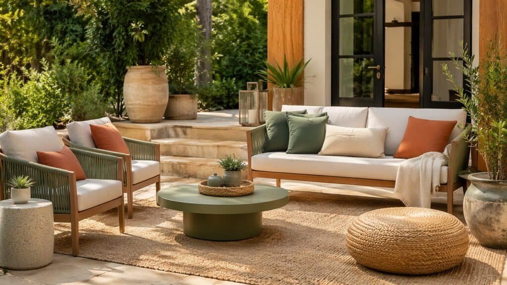
Outdoor Furniture Colour Trend 2027: Deep Greens & Botanical Shades
Green isn’t just a trend in 2027—it’s a design anchor. As outdoor spaces become more immersive and nature-focused, deep greens are taking center stage in outdoor furniture colour trend 2027.
The Shades Defining the Trend
Not all greens feel the same. The most popular variations include:
- Olive – soft, earthy, and versatile
- Moss green – muted and calming
- Eucalyptus – light, modern, slightly greyed
- Forest green – rich, bold, and grounding
Each tone brings a slightly different mood, but all share one thing: a strong connection to nature.
Why Green Works So Well Outdoors
Green blends seamlessly with natural surroundings, making it one of the easiest colours to use. It:
- Reduces visual contrast with plants and landscaping
- Feels calming and restorative
- Works in both modern and rustic settings
Even in urban balconies, green furniture can soften the space instantly.
Where Deep Greens Look Best
Botanical shades perform especially well in:
- Garden patios with lots of greenery
- Shaded outdoor areas
- Spaces with wood or stone elements
In minimalist spaces, darker greens can even replace black as a softer alternative for contrast.
Easy Pairing Ideas
To elevate green furniture, try pairing it with:
- Warm metals like brass or gold for a refined look
- Terracotta accents for a Mediterranean feel
- Neutral cushions to keep the palette balanced
Used thoughtfully, green becomes more than a colour—it becomes the backbone of the entire design.
Sun-Washed Warm Tones: Terracotta, Rust & Burnt Orange
Warm tones are bringing energy back into outdoor design. Inspired by sun-soaked landscapes, these colours are a standout feature of outdoor furniture colour trend 2027.
Why Warm Colours Are Trending Again
After years of cooler palettes, homeowners are embracing warmth for a more inviting atmosphere. These tones:
- Add instant coziness
- Reflect sunlight beautifully
- Create a relaxed, vacation-like vibe
They feel especially natural in outdoor environments where sunlight enhances their richness.
The Key Shades to Watch
The 2027 palette leans toward muted warmth, not overly bright hues:
- Terracotta – earthy and timeless
- Rust – deeper, more dramatic
- Burnt orange – vibrant yet grounded
- Soft clay tones – subtle and versatile
These colours work well as both primary furniture finishes and accent pieces.
How to Use Warm Tones Without Overdoing It
Balance is everything with warm shades. A few practical tips:
- Pair with neutral bases like beige or taupe
- Limit bold tones to one or two key pieces
- Use textiles (cushions, throws) for flexibility
For example, a neutral sofa with terracotta cushions feels fresh without being overwhelming.
Best Settings for Warm Colour Palettes
These tones shine in:
- Sun-drenched patios
- Mediterranean or bohemian-style spaces
- Homes with natural stone or stucco exteriors
They bring a sense of warmth and personality that cooler palettes often lack.
Cool Coastal Blues: From Soft Sky to Deep Navy
Blue continues to evolve in outdoor furniture colour trend 2027, shifting from predictable coastal themes to more refined and layered applications.
The Spectrum of Blues in 2027
This year’s blues range from light and airy to deep and dramatic:
- Sky blue – soft and uplifting
- Powder blue – subtle and modern
- Teal – rich with a hint of green
- Navy – bold, classic, and grounding
Each shade offers a different level of visual impact.
Creating a Calm, Open Atmosphere
Lighter blues are ideal for making outdoor areas feel:
- More spacious
- Brighter and fresher
- Relaxing and breezy
They’re especially effective in small balconies or compact patios where openness matters.
Using Dark Blues for Contrast
Darker shades like navy can anchor a space in a sophisticated way. They work well when:
- Paired with white or light neutrals
- Used in structured furniture (metal frames, dining sets)
- Balanced with softer textures like cushions or rugs
Navy, in particular, is becoming a go-to alternative to black in outdoor design.
Coastal vs Modern Blue Styling
Blue doesn’t have to feel nautical. You can tailor it to your style:
- Coastal look → blue + white + natural textures
- Modern look → navy + grey + clean lines
- Relaxed contemporary → teal + wood + soft neutrals
This flexibility makes blue one of the most adaptable colours in 2027.
Outdoor Furniture Colour Trend 2027: Unexpected Bold Accents
Bold colours haven’t disappeared—they’ve just become more intentional. In outdoor furniture colour trend 2027, vibrant hues are used as accents that energize a space without overpowering it.
The New Approach to Bold Colour
Instead of full furniture sets in bright tones, 2027 styling focuses on controlled pops of colour. This creates visual interest while keeping the overall design grounded.
Trending Accent Colours
Look for these standout shades:
- Mustard yellow – warm, modern, and slightly retro
- Muted coral – soft yet lively
- Dusty red – bold without being harsh
- Ochre and golden tones – rich and earthy
These colours feel more refined than primary brights, making them easier to integrate.
Where to Use Bold Accents
Strategic placement makes all the difference:
- Accent chairs or a single statement bench
- Outdoor cushions and throw pillows
- Side tables, planters, or decor pieces
Small touches go a long way. A neutral setup with just a few bold accents often feels more polished than an overly colourful layout.
When Bold Colours Work Best
Bold accents are especially effective in:
- Minimalist or neutral-heavy spaces
- Small patios that need personality
- Areas lacking natural greenery
Used wisely, bold colour becomes a highlight—not a distraction.
Monochromatic Outdoor Styling: A 2027 Design Shift
One of the most sophisticated directions in outdoor furniture colour trend 2027 is the rise of monochromatic styling—designing a space around a single colour family.
Why Monochrome Feels So Modern
Monochromatic palettes create:
- A clean, cohesive look
- A sense of calm and order
- A more luxurious, curated feel
Instead of relying on contrast, the focus shifts to depth and variation within one tone.
How to Build a Monochromatic Outdoor Space
The key is layering, not matching everything exactly.
Start with:
- A base colour (e.g., beige, green, or grey)
- Multiple shades within that colour family
- Different textures and materials
Example setup:
- Sofa in soft taupe
- Cushions in cream and sand
- Wooden table with warm undertones
The result feels rich and intentional, not flat.
Popular Monochrome Ideas for 2027
Some of the most appealing combinations include:
- All-beige palettes for a warm, spa-like feel
- All-green spaces that blend into the landscape
- Soft grey layers for a modern, minimalist vibe
Each option offers a different mood while maintaining simplicity.
Common Mistakes to Avoid
Monochrome can fall flat if not done carefully. Watch out for:
- Using identical shades with no variation
- Ignoring texture differences
- Forgetting small contrast elements (like metal or wood accents)
Done right, monochromatic styling delivers effortless elegance.
Material Meets Colour: How Finishes Affect the Look
Colour doesn’t exist in isolation. The way it appears on outdoor furniture depends heavily on materials and finishes—a crucial but often overlooked part of outdoor furniture colour trend 2027.
Matte vs Glossy: What’s Trending?
In 2027, matte finishes are leading the way.
- Matte finishes → soft, modern, reduce glare
- Glossy finishes → more reflective, slightly dated in outdoor settings
Matte surfaces also hide imperfections better, making them practical for outdoor use.
How Materials Change Colour Perception
The same colour can look completely different depending on the material:
- Wood → warms up any colour tone
- Metal → sharpens and modernizes colours
- Fabric → softens and diffuses colour intensity
- Rattan/wicker → adds depth through texture
Understanding this helps you avoid mismatched combinations.
The Impact of Sunlight on Colour
Outdoor lighting is constantly changing, which affects how colours appear:
- Bright sunlight can make colours look lighter or washed out
- Shade deepens tones and enhances richness
- Sunset adds warm undertones to most colours
Testing colours in your actual outdoor space before committing is always a smart move.
Choosing Fade-Resistant Colours and Finishes
Durability matters just as much as aesthetics. Look for:
- UV-resistant coatings on metal and plastic
- Solution-dyed fabrics that retain colour longer
- Natural materials that age gracefully instead of fading unevenly
A beautiful colour is only worth it if it lasts beyond one season.
Climate-Smart Colour Choices for Outdoor Furniture
A beautiful palette won’t hold up if it fights your environment. Outdoor furniture colour trend 2027 leans heavily into climate-aware choices—colours that look great and perform well where you live.
Light vs Dark: What Works in Your Climate?
- Hot, sunny climates → choose light tones (sand, beige, soft grey) to reflect heat and stay comfortable
- Cool or shaded areas → deeper tones (green, navy, rust) add warmth and visual depth
- Mixed conditions → combine a light base with darker accents for balance
Durability Matters More Than Ever
Outdoor colour isn’t just about aesthetics—it’s about longevity. Prioritize:
- UV-resistant finishes to prevent fading
- Fabrics labeled solution-dyed for long-term colour retention
- Powder-coated metals that resist chipping and discoloration
Practical Considerations You Shouldn’t Ignore
Daily use affects how colours age:
- Dust-prone areas → mid-tones (taupe, olive) hide dirt better
- Rain-heavy climates → avoid very light fabrics that stain easily
- Coastal zones → salt air pairs better with muted, weathered tones
Quick Climate Guide
| Environment | Best Colour Choices |
| Tropical | Light neutrals, soft greens |
| Coastal | Blues, sandy tones, weathered grey |
| Dry/Desert | Terracotta, clay, warm beige |
| Urban/City | Greys, greens, muted accents |
Choosing climate-smart colours ensures your outdoor setup looks intentional year-round, not just on day one.
Styling Ideas: How to Combine 2027 Colour Trends Like a Designer
Knowing the trends is one thing—using them well is where most people struggle. This is where outdoor furniture colour trend 2027 becomes practical.
Ready-to-Use Colour Palettes
Here are a few combinations that consistently work:
Calm Natural Retreat
- Base: warm beige
- Accent: olive green
- Detail: soft white textiles
Modern Coastal
- Base: light grey
- Accent: navy blue
- Detail: natural wood
Warm Mediterranean
- Base: sand or cream
- Accent: terracotta
- Detail: brass or gold finishes
Contemporary Minimal
- Base: soft taupe
- Accent: muted black or deep green
- Detail: textured fabrics
How to Mix Without Clashing
Follow a simple structure:
- 60% dominant base colour
- 30% secondary tone
- 10% accent colour
This keeps your space visually balanced.
Small Space vs Large Space Strategy
- Small patios/balconies → stick to lighter tones with minimal contrast
- Larger outdoor areas → introduce deeper colours and layered palettes
Scale influences how bold you can go.
Pro Tip: Let Surroundings Guide You
Look at your home’s exterior, flooring, and landscaping. Your furniture colours should feel like a natural extension, not a separate design.
Common Colour Mistakes to Avoid in Outdoor Furniture
Even great colours can fail if applied poorly. Avoid these common pitfalls to get the most out of outdoor furniture colour trend 2027.
Overloading on Bold Colours
Too many statement tones can feel chaotic. Limit bold shades to accent roles, not the entire setup.
Ignoring Your Home’s Exterior Palette
Outdoor furniture should complement your house—not clash with it. Pay attention to:
- Wall colour
- Roof tones
- Flooring materials
Chasing Trends Without Longevity
Trendy colours can be tempting, but large furniture pieces should lean toward timeless shades. Use accessories to experiment instead.
Lack of Contrast or Depth
A single flat tone without variation can feel dull. Always include:
- Texture
- Shade variation
- At least one contrasting element
Small adjustments make a big difference.
Related Trends to Watch
Outdoor furniture colour trend 2027 doesn’t exist in isolation. It connects naturally with other design directions worth exploring.
Outdoor Decor Trends 2027
Lighting, rugs, and accessories are shifting toward:
- Natural textures
- Layered fabrics
- Soft, ambient lighting
These elements reinforce your colour palette and complete the look.
Exterior House Colour Trends 2027
Your outdoor furniture should align with your home’s exterior. Trending house colours include:
- Warm whites and creams
- Earthy greens and browns
- Soft, muted greys
Consistency between architecture and furniture creates a cohesive visual story.
Patio Layout & Design Ideas
Colour works best when paired with smart layouts:
- Zoning spaces for dining vs lounging
- Using rugs to define areas
- Arranging furniture for flow and comfort
Design and colour should always work together—not separately.
Final Thoughts: Choosing the Right Outdoor Furniture Colour for Your Space
Outdoor furniture colour trend 2027 offers more flexibility than ever—but that doesn’t mean every option will suit your space.
The smartest approach is to:
- Start with a neutral, versatile base
- Layer in nature-inspired tones
- Add controlled accents for personality
If you’re unsure, test with cushions or accessories before committing to large pieces.
For deeper insight into how colour choices influence mood and perception in living spaces, this guide from the Nielsen Norman Group is worth exploring:
https://www.nngroup.com/articles/color-psychology/
FAQs About Outdoor Furniture Colour Trend 2027
What is the most popular outdoor furniture colour for 2027?
Warm neutrals like beige, taupe, and sand are leading, often paired with green or terracotta accents.
Are dark colours a bad choice for outdoor furniture?
Not at all. Dark tones like navy or forest green work well, especially in shaded areas or as contrast elements.
How do I choose a colour that won’t go out of style?
Stick with neutral bases and introduce trends through smaller, replaceable items like cushions or decor.
Do outdoor furniture colours fade quickly?
High-quality materials with UV-resistant finishes and solution-dyed fabrics can maintain colour for years.
Can I mix multiple colour trends in one outdoor space?
Yes, but keep it balanced. Use one dominant palette and limit bold accents to avoid visual clutter.
Ready to refresh your outdoor space? Start by choosing one colour direction from these 2027 trends and build around it—your patio will instantly feel more cohesive, modern, and inviting.
