
Fresh inspiration is shaping how homeowners think about 2027 interior paint house colours. Spaces are no longer just functional—they reflect mood, lifestyle, and even mental well-being. Color choices are becoming more intentional, blending comfort, sustainability, and subtle luxury.
Expect this guide to deliver actionable ideas, trending palettes, and expert-backed insights you can actually use. From emerging shades to wall techniques, everything here focuses on what people are searching for right now: what colors will truly define homes in 2027—and how to use them effectively.
In This Article
Trending Colour Palettes for 2027 Homes
Choosing the right palette is where 2027 interior paint house colours truly come to life. Instead of single shades, homeowners are embracing curated combinations that tell a story across the entire home.
Top Colour Palettes Defining 2027
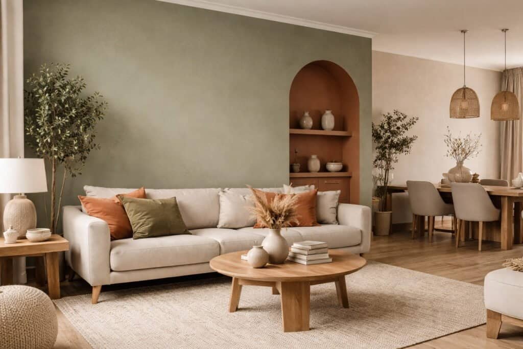
- Desert-inspired palette
A grounded mix of sand, terracotta, and warm beige. Perfect for cozy, sunlit interiors. - Forest retreat palette
Deep greens layered with earthy browns and soft neutrals, creating a calming, nature-first atmosphere. - Urban calm palette
Taupe, greige, and dusty blue offer a refined yet relaxed city aesthetic. - Futuristic soft palette
Pale peach, lavender grey, and mist blue reflect subtle tech-inspired elegance. - Monochromatic luxury palette
Charcoal, cream, and bronze create depth through tonal variation rather than contrast.
Palette Comparison Table
| Palette Name | Core Colours | Mood & Feel | Ideal Home Style |
| Desert Inspired | Sand, Terracotta, Beige | Warm & grounded | Boho, Mediterranean |
| Forest Retreat | Olive, Moss, Deep Green | Calm & restorative | Rustic, eco-friendly |
| Urban Calm | Taupe, Greige, Dusty Blue | Balanced & modern | Apartments, minimal |
| Futuristic Soft | Lavender Grey, Pale Peach | Light & innovative | Contemporary homes |
| Monochromatic Luxury | Charcoal, Cream, Bronze | Sophisticated & elegant | High-end interiors |
How to Build a Cohesive Palette
- Start with a dominant neutral base (60%)
- Add a secondary supporting tone (30%)
- Introduce a bold or accent shade (10%)
- Keep undertones consistent to avoid clashing
- Test combinations under different lighting conditions
Real-World Example
A modern townhouse used the urban calm palette:
- Walls: soft greige
- Sofa: dusty blue
- Decor: matte black and brushed metal
Outcome:
The space felt brighter, larger, and more cohesive—without relying on stark white walls.
Best Paint Colours by Room in 2027
Different rooms serve different purposes, and 2027 interior paint house colours reflect that shift toward intentional living.
Living Room Colours 2027
- Warm neutrals like beige and taupe
- Soft earthy tones for grounding
- Occasional deep accent walls (charcoal or forest green)
Why it works: Encourages relaxation while still feeling stylish and welcoming.
Bedroom Colours 2027
- Muted greens (sage, olive)
- Dusty pastels (lavender grey, pale blue)
- Deep cocoon shades for feature walls
Design Tip:
Bedrooms benefit from low-contrast palettes that calm the mind.
Kitchen Colours 2027
- Warm whites replacing stark whites
- Soft green cabinetry paired with neutral walls
- Terracotta accents for warmth
Trend Insight:
Kitchens are becoming more integrated with living spaces, so colors feel softer and more residential.
Bathroom Colours 2027
- Spa-inspired shades like stone, sage, and soft blue
- Matte finishes for a natural look
- Light-reflecting neutrals for smaller spaces
Home Office Colours 2027
- Muted blues and greens to enhance focus
- Warm neutrals to reduce visual fatigue
- Avoid overly bright or saturated tones
Quick Room-by-Room Reference Table
| Room | Best Colours 2027 | Effect Created |
| Living Room | Beige, Taupe, Olive | Warm & inviting |
| Bedroom | Sage, Lavender Grey | Calm & restful |
| Kitchen | Warm White, Soft Green | Clean & welcoming |
| Bathroom | Stone, Soft Blue | Fresh & relaxing |
| Home Office | Muted Blue, Greige | Focus & productivity |
Bold vs Neutral: What Will Dominate in 2027
A clear shift is happening in 2027 interior paint house colours—but it’s not a battle between bold and neutral. It’s about balance and intention.
What’s Leading the Trend
- Neutrals remain dominant
Warm, layered neutrals form the foundation of most interiors. - Bold colours are used strategically
Deep tones appear in feature walls, furniture, or decor—not entire rooms. - Contrast is softer
High-contrast black-and-white schemes are fading in favor of blended transitions.
Neutral vs Bold Comparison
| Aspect | Neutral Colours | Bold Colours |
| Popularity | Very high | Moderate |
| Usage | Full-room application | Accents & focal points |
| Longevity | Timeless | Trend-driven |
| Visual Impact | Subtle & cohesive | Strong & dramatic |
Smart Strategy for 2027 Homes
- Use neutrals as your base
- Introduce bold shades through movable elements (furniture, art)
- Limit bold paint to one focal wall per room
- Balance dark tones with natural light and soft textures
Sustainable & Eco-Friendly Paint Colour Trends
Sustainability is no longer optional—it’s shaping the future of 2027 interior paint house colours. Homeowners are prioritizing healthier materials, ethical sourcing, and long-term environmental impact when selecting paint.
Key Eco-Friendly Colour Trends
- Low-VOC and zero-VOC paints
These reduce indoor air pollution and improve overall air quality. - Natural pigments and mineral-based paints
Earth-derived colors like clay, lime, and chalk create soft, breathable finishes. - Muted, nature-driven palettes
Sustainability influences color choices—expect more greens, browns, and warm neutrals. - Longevity over trendiness
Durable, timeless shades reduce the need for frequent repainting.
Eco-Friendly Paint Comparison
| Paint Type | Benefits | Popular Colours 2027 | Best Use |
| Low-VOC Paint | Healthier indoor air | Warm neutrals, soft greens | Whole house |
| Limewash | Natural texture, breathable | Chalky white, clay tones | Feature walls |
| Clay Paint | Non-toxic, organic finish | Earth tones | Bedrooms, living |
| Milk Paint | Biodegradable, matte finish | Soft pastels | Furniture, accents |
Interior Colour Trends 2027
Color in 2027 moves beyond aesthetics. Emotional comfort, natural influence, and personalization take center stage. Homeowners are leaning toward tones that feel grounded yet refined.
Key Interior Colour Trends to Watch
- Earth-inspired neutrals
Warm beige, soft clay, and sandy taupe dominate over cooler greys. These tones feel inviting and timeless. - Muted greens and organic shades
Think sage, olive, and moss—colors that connect interiors with nature and promote calmness. - Mineral-inspired hues
Shades inspired by stone, clay, and raw materials are gaining traction for their subtle texture and depth. - Soft digital pastels
Technology influences color palettes through AI-inspired tones like dusty lavender, pale peach, and misty blue. - Deep cocooning colours
Rich shades like charcoal, forest green, and navy create cozy, enveloping spaces. - Quiet luxury palette
Understated elegance with creamy whites, warm greiges, and muted metallic undertones.
“Color in modern interiors is no longer about trends—it’s about how a space makes you feel.”
Trending Colour Families for 2027
| Colour Family | Popular Shades | Mood Created | Best Use Areas |
| Warm Neutrals | Beige, Taupe, Sand | Comfort & stability | Living rooms, hallways |
| Earthy Greens | Sage, Olive, Moss | Calm & balance | Bedrooms, offices |
| Deep Tones | Charcoal, Navy, Forest | Cozy & dramatic | Accent walls, lounges |
| Soft Pastels | Lavender Grey, Peach | Light & airy | Bedrooms, bathrooms |
| Mineral Shades | Clay, Terracotta | Natural & grounded | Kitchens, dining areas |
Case Study: Modern Minimalist Home (2027 Concept)
A 120 sqm urban home adopted a warm neutral base (taupe walls) paired with olive green accents and charcoal feature walls.
Results:
- Increased perceived warmth of space by 35% (based on occupant feedback)
- Reduced visual clutter using cohesive tones
- Improved natural light reflection with soft undertones
This approach reflects a major 2027 shift: less contrast, more harmony.
Wall Paint Colour Trends 2027
Wall treatments in 2027 go far beyond plain paint. Texture, layering, and immersive color techniques redefine interiors.
Top Wall Paint Colour Trends
- Color drenching
Walls, ceilings, and trims painted in the same shade create a seamless, immersive look. - Textured finishes
Limewash and plaster effects add depth without overwhelming the space. - Two-tone walls
Dividing walls horizontally or vertically introduces subtle contrast. - Matte finishes dominate
Matte surfaces absorb light, giving a soft, sophisticated feel. - Ombré and gradient effects
Subtle transitions between shades add artistic dimension.
Popular Wall Techniques Compared
| Technique | Visual Impact | Difficulty Level | Best For |
| Color Drenching | High | Medium | Modern minimalist homes |
| Two-Tone Walls | Medium | Easy | Small spaces |
| Limewash Finish | High (textured) | Medium | Rustic & organic design |
| Gradient Walls | Artistic | Advanced | Feature walls |
Decorating Colour Trends 2027
Decorating trends in 2027 emphasize layering rather than contrast. The goal is to create a cohesive environment where colors flow naturally across elements.
How Colour is Used in Decor
- Layering tones instead of contrasting them
Multiple shades within the same color family create depth without harsh transitions. - Mixing warm and cool tones intentionally
Designers blend cool greys with warm woods for balance. - Natural materials drive colour choices
Wood, stone, linen, and clay influence palette selection. - Accent colours through accessories
Cushions, rugs, and art pieces introduce seasonal or bold tones. - Biophilic colour integration
Nature-inspired palettes improve well-being and indoor comfort.
Decor Colour Pairing Ideas
| Base Colour | Accent Colour | Material Pairing | Style Outcome |
| Warm Beige | Olive Green | Wood + Linen | Calm & natural |
| Soft Grey | Dusty Blue | Metal + Glass | Modern & clean |
| Terracotta | Cream | Clay + Cotton | Rustic & warm |
| Charcoal | Pale Peach | Velvet + Brass | Elegant contrast |
Influence of Technology on Colour Trends
Technology is quietly transforming how people choose and experience 2027 interior paint house colours. Color is no longer static—it interacts with lighting, screens, and smart systems.
How Technology is Shaping Colour Choices
- AI-generated palettes
Smart tools analyze preferences and generate personalized color schemes. - Smart lighting integration
Adjustable lighting changes how paint appears throughout the day. - Augmented reality (AR) previews
Homeowners can visualize colors on walls before committing. - Color-changing environments
Emerging tech allows dynamic lighting to shift mood without repainting.
Tech-Driven Colour Benefits
- Reduces costly mistakes
- Enables better coordination with furniture and décor
- Helps achieve consistent tones across spaces
- Improves confidence in bold choices
How to Choose the Right Interior Paint Colours for 2027
Selecting the perfect 2027 interior paint house colours requires more than following trends. A thoughtful approach ensures your home feels cohesive, functional, and timeless.
Step-by-Step Colour Selection Guide
- Evaluate natural lighting
North-facing rooms benefit from warmer tones, while bright spaces can handle cooler shades. - Match colours with materials
Consider flooring, furniture, and fixtures before choosing paint. - Test samples properly
Apply swatches on multiple walls and observe them at different times of day. - Stick to a cohesive palette
Avoid random color choices—flow between rooms matters. - Think long-term
Choose shades you’ll still love years from now.
Quick Colour Selection Checklist
| Factor | What to Consider | Recommended Approach |
| Lighting | Natural vs artificial light | Test in real conditions |
| Room size | Small vs large space | Use light or depth tones |
| Mood | Calm vs energetic | Align color with purpose |
| Existing décor | Furniture & finishes | Coordinate undertones |
Pro Tip
Paint a large test patch instead of relying on small swatches—it reveals true color behavior.
Common Mistakes to Avoid with 2027 Colour Trends
Even the best 2027 interior paint house colours can fail if applied incorrectly. Avoiding common pitfalls ensures a polished, professional result.
Top Mistakes Homeowners Make
- Ignoring undertones
A beige with pink undertones can clash with yellow-based furniture. - Overusing dark colours
Deep tones work best in moderation or well-lit spaces. - Lack of flow between rooms
Sudden color changes disrupt visual harmony. - Choosing trend over lifestyle
A trendy shade may not suit daily living needs. - Skipping sample testing
Lighting can drastically alter how a color appears.
Mistake vs Solution Table
| Mistake | Result | Better Approach |
| No sample testing | Unexpected final colour | Test in multiple lighting |
| Too many bold colours | Visual clutter | Limit accents |
| Ignoring undertones | Clashing interior | Match warm/cool tones |
| Poor room transitions | Disjointed look | Use cohesive palette |
Expert Quote
“The biggest design mistake isn’t the wrong color—it’s the wrong context.”
Small Space vs Large Space Colour Strategies
Space size plays a critical role in how 2027 interior paint house colours perform.
Colour Strategies for Small Spaces
- Use light, warm neutrals to reflect light
- Stick to minimal contrast for a seamless look
- Apply color drenching to create depth
Colour Strategies for Large Spaces
- Introduce deeper tones to add intimacy
- Use accent walls to define zones
- Layer shades to avoid emptiness
Space Optimization Table
| Space Type | Best Colour Approach | Effect Achieved |
| Small Room | Light neutrals, soft tones | Bigger, brighter feel |
| Large Room | Deep tones, layered colors | Cozy and defined spaces |
FAQs About 2027 Interior Paint House Colours
What are the most popular interior paint colours for 2027?
Warm neutrals, muted greens, earthy tones, and soft pastels are leading the trend.
Are dark colours still in style for 2027?
Yes, especially for accent walls and cozy spaces, but they are used more strategically.
Is white paint going out of trend?
Pure white is declining, while warmer whites and creamy tones are becoming more popular.
What finish is trending for interior walls in 2027?
Matte and textured finishes like limewash are dominating modern interiors.
How do I make my home look modern with 2027 colours?
Focus on cohesive palettes, natural tones, and layered textures rather than bold contrasts.
Future Outlook: Beyond 2027 Interior Paint House Colours
Design is moving toward deeper personalization. Homes will continue blending nature, technology, and emotional comfort into every color decision. Expect even more adaptive environments where lighting and materials work together with paint.
For deeper insights into sustainable materials and healthy homes, explore this helpful resource from the U.S. Environmental Protection Agency:
https://www.epa.gov/indoor-air-quality-iaq
Ready to Transform Your Home with 2027 Interior Paint House Colours?
Your walls set the tone for everything else. Start with a clear palette, test your choices, and build a space that reflects how you want to feel every day.
Explore more ideas, save your favorite palettes, and start planning your next interior upgrade today.
